Climate Change Scarf
I recently took up knitting as a hobby and as a first project I decided to knit a “climate change scarf”.
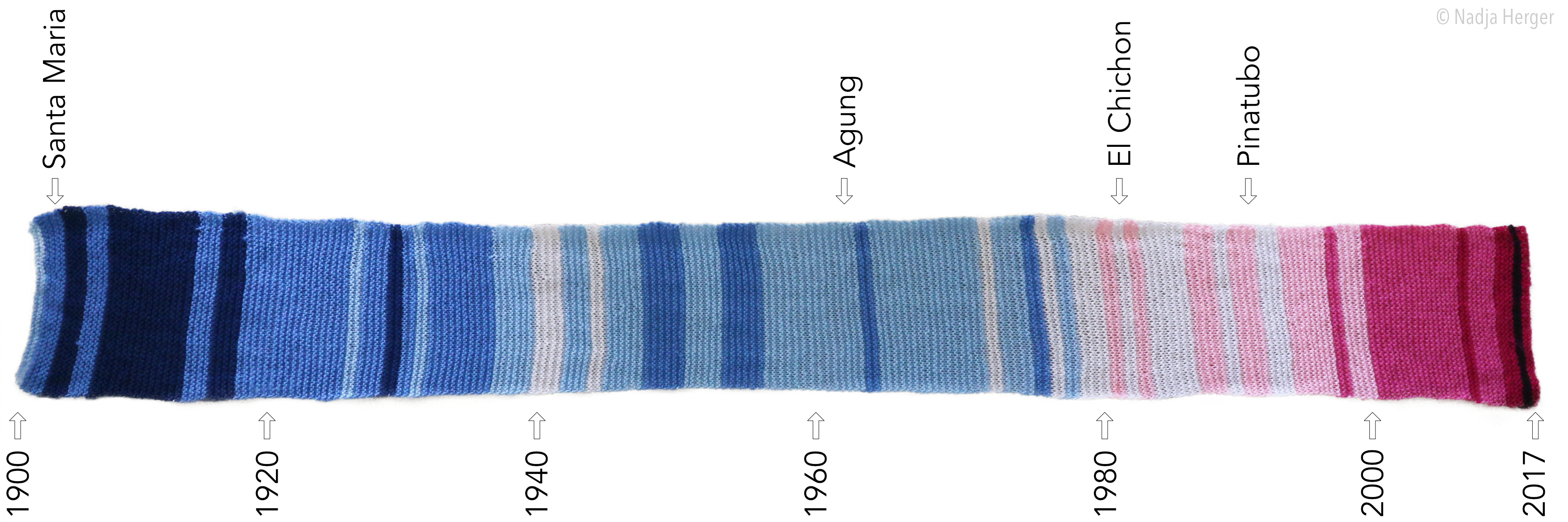
The colours on the scarf correspond to global temperature anomalies (base period: 1951-1980), with blue colours indicating below average temperatures and red colours high temperature anomalies. The scarf spans from 1900 to 2017 with two knitted rows per year. The scarf is based on the GISTEMP dataset. You can find the data and the corresponding colours in this excel spread sheet.
One can see the global warming signal over time as the scarf turns from blues to reds. This long-term trend is due to human activity, and mainly comes from the burning of fossil fuels from the beginning of the industrial revolution.
If you would like to reproduce the exact same scarf, I used the ESTHER 8ply yarn from Lincraft in the following colourways: Denim Blue, Cornflower, Light Blue, Pure White, Pink, Hot Pink, Fuchsia, Black.
A photo of the scarf is shown below (volcanic eruptions are listed on top).

Welcome to my site! I hope you find something interesting here.
- Lessons learned in AI Governance
- My Journey from Climate Science into Responsible AI
- Photo Clustering
- Multi-objective optimisation and Pareto optimality
- Out-of-Sample Testing in Climate Science
- Climate Change Scarf
- Hackathon
- Combinatorial optimisation with Gurobi
- Visualising the model space with unsupervised learning
- Setting up Jekyll on GitHub Pages